
New Features: Palette Naming & Color Descriptions
We just rolled out two game-changing features to the CSS Color Converter & Variable Tool (opens in a new window): editable palette names and color descriptions. These might seem like small additions, but they’ll make your workflow so much smoother.
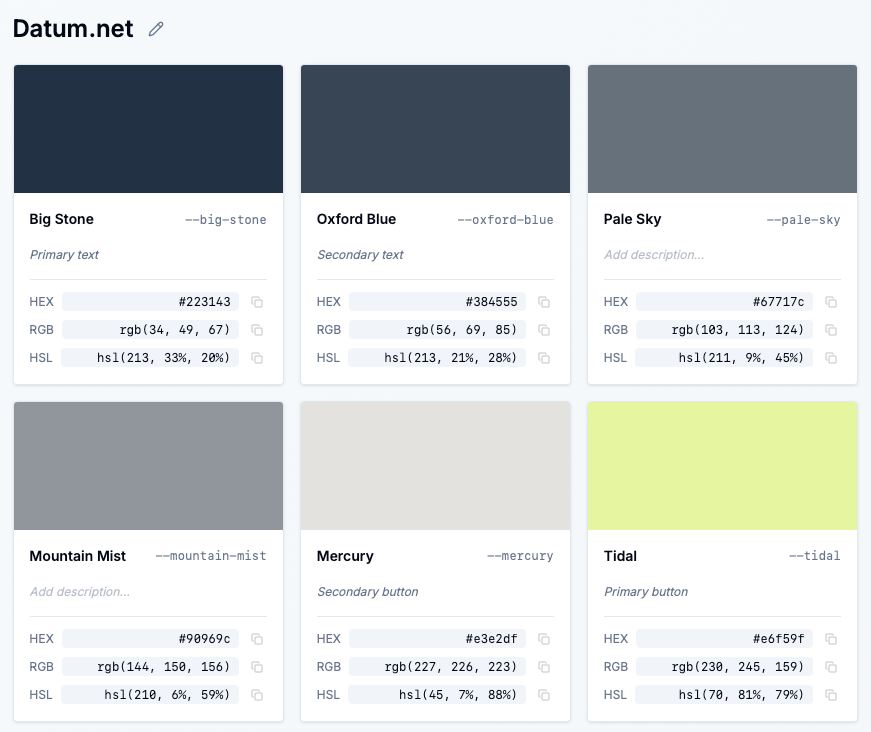
Remember when every palette was just “Palette 1”, “Palette 2”, “Palette 3”? Not anymore. Now you can:
- Click to edit any palette name directly in the UI
- Auto-save happens instantly—no save button needed
- Visual indicator (pencil icon) shows you can edit
- Keyboard shortcuts: Press
Enterto save,Escapeto cancel
Just click on the palette name above your color cards, type your custom name like “Brand Colors” or “Dashboard Theme”, and you’re done. It’s that simple.
Ever copied CSS variables and forgot what each color was for? We’ve got you covered. Now you can:
- Add descriptions to each color in your palette
- Inline editing right on the color card
- Auto-save as you type
- See descriptions in CSS as helpful comments
When you generate your CSS variables, descriptions appear as inline comments next to each variable:
/** * Generated by Sewwa Color Converter * https://www.sewwa.com/color-palette * Palette: My Brand Colors */:root { --royal-blue: #4169e1; /* Primary button color */ --tomato-alpha-50: rgba(255, 99, 71, 0.5); /* Error state indicator */ --lime-green: #32cd32; /* Success notification */}No more guessing what --royal-blue is used for. Your future self (and your teammates) will thank you.
Working with color palettes was functional but… forgetful. You’d generate a palette, use it in your project, and a week later wonder: “Wait, what was this palette for again?” Or you’d share CSS variables with your team and get questions like “What’s this color supposed to be used for?”
You’d end up:
- Creating separate documentation files
- Adding comments manually in your CSS
- Keeping mental notes (that you’d forget)
- Explaining colors over and over in code reviews
With palette names and color descriptions:
- Better organization: Instantly know what each palette is for
- Self-documenting CSS: Descriptions travel with your code
- Team collaboration: No more “what does this color do?” questions
- Faster workflow: Everything auto-saves, no extra steps
It’s like having a built-in documentation system that follows your colors everywhere they go.
Create a palette called “Primary Brand Colors” and add descriptions like:
- “Main brand color for headers and CTAs”
- “Hover state for primary buttons”
- “Background tint for hero sections”
When you copy the CSS, your entire team gets context with the code.
Name your palette “Dashboard Cards” and describe each color:
- “Card background with 10% opacity”
- “Border color for active states”
- “Text color for card titles”
Perfect for component libraries where context matters.
Add descriptions that include accessibility info:
- “WCAG AA compliant for text on white”
- “High contrast for focus states”
- “Used only for decorative elements”
Your CSS becomes a knowledge base.
Visit https://www.sewwa.com/color-palette (opens in a new window) and:
- Generate a palette (or load one from history)
- Click the palette name above the color cards to rename it
- Type descriptions in the input fields below each color name
- Generate CSS variables and see your descriptions appear as comments
Everything auto-saves, so you can focus on what matters: building great designs.
Have feedback or feature requests? Let us know here (opens in a new window).